Mortar Kombat
 Wednesday, May 15, 2013 at 10:20AM
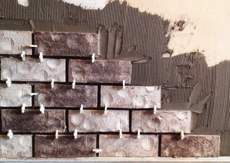
Guess what, guys! I am FINALLY done with my brick wall project. Yippee! Hooray! Whew.
Once the mortar was mixed and the bricks had been laid out, I experienced a major "Oh-crap-what-have-I-gotten-myself-into" moment. I honestly felt that I'd bitten off more than I could chew. But everything was all set and ready to go, and those naked, patched-up walls were seriously starting to make my eyes bleed. So there was no turning back. It was time to get down and dirty.
It's been a grueling, dusty, and extremely rewarding month. Here's the recap of my first foray into masonry:
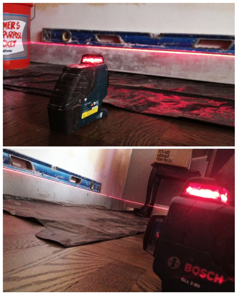
Recognize this awesome laser? A perfectly level foundation is the key to a straight wall, so I used this handy tool to guarantee that my bolsters were 100% straight prior to laying the first brick.
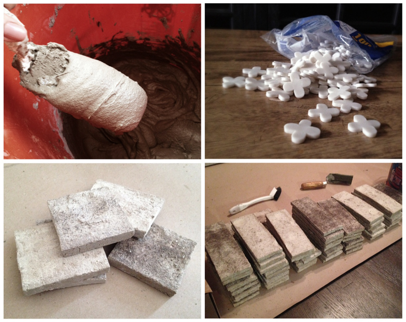 Next, I combined powdered thinset mortar with water and mixed it into a thick, batter-like consistency. The boxes of veneers came in mixed assortments of grays and browns, so I organized all the bricks by color in order to plan out an even distribution of all the variations.
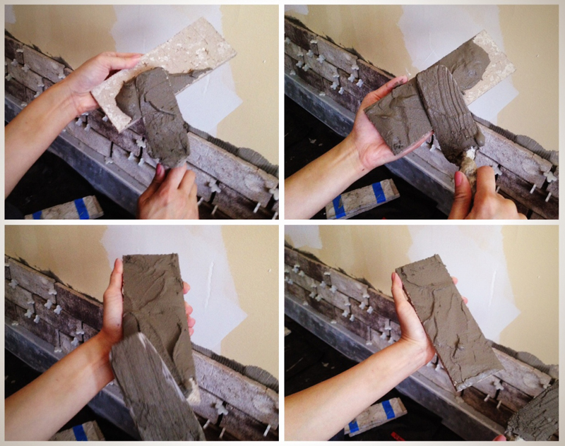
This technique is called back-buttering, and it really is like spreading peanut butter onto a piece of toast! I found that an even 2/3" layer was enough to grip the wall without oozing everywhere.
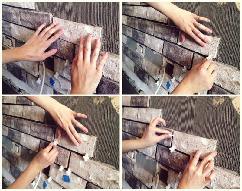 After back-buttering, I pushed and wiggled each tile against the wall until the mortar started pulling at the brick. Once the suction was created, I slowly slid the brick up and over, using spacers to maintain even distancing between each brick. I went with 3/8" spacers, which is the standard joint spacing for real brick walls.
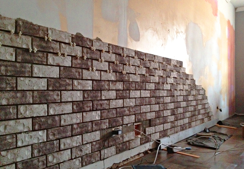
------------ Repeat for 280 square feet. ------------
It took me about two days to get a hang of the fundamental techniques and stop making huge messes everywhere. After that, I started throwing bricks on the wall like nobody's business. This project didn't call for any extraordinary skills, but it did require an insane amount of tedious repetition and grunt work. I can't even complain, because all that squatting, lifting, bending, and reaching totally whipped me into shape ;-)
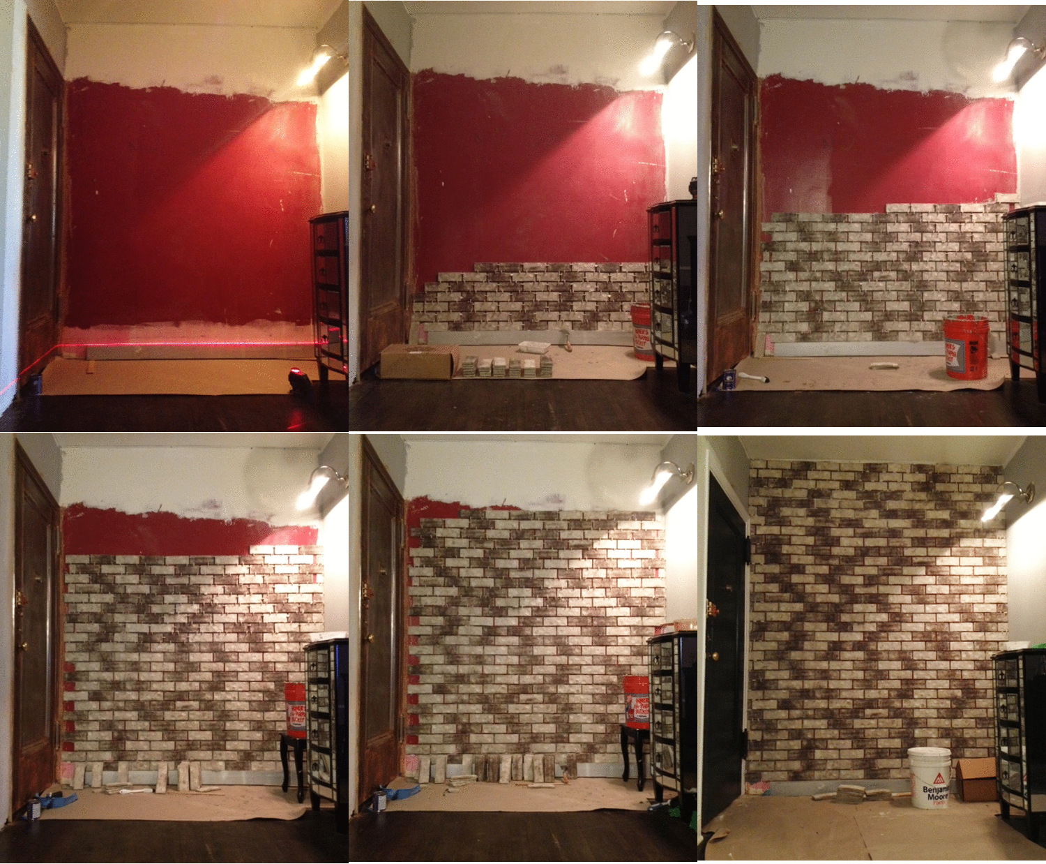 I also tackled a smaller wall by our entryway in order to establish a smooth, transitional flow into the living room. The previous owners were obviously really into the color red. I think it made them happy. Kinda like how Wonka makes me happy.
Mid-point laser check! Yup, still straight :)
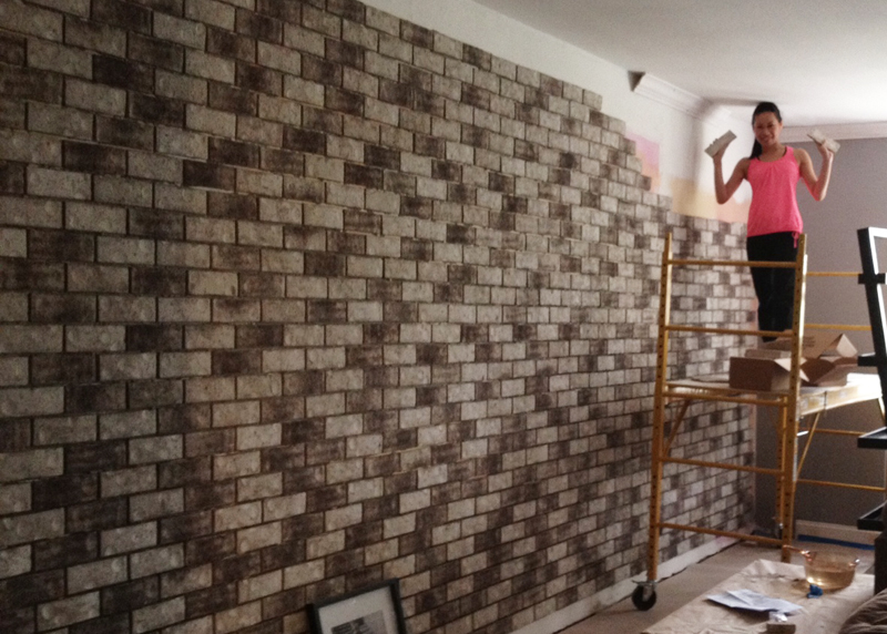 Almost there!! Chris and I signed the back of the final brick before it was set into place, and...
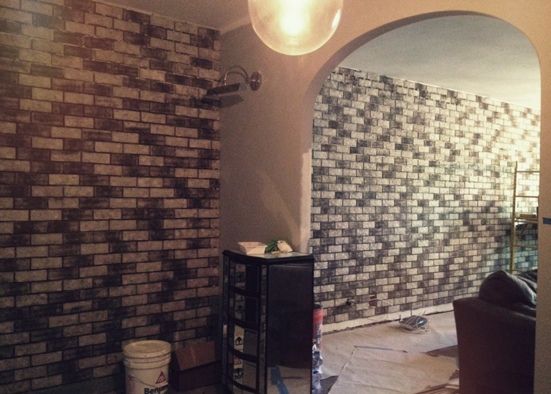 Bam! All done.
This project was a true labor of love. Sure, I've been sporting a set of calloused man hands for about a month, and I also dropped/broke a brick on my foot, rendering myself incapable of wearing any cute shoes for the next few weeks. But the wall is finally complete, and I am deliriously happy with the outcome.
Once the crown and base mouldings are installed, our living room renovation will be finished! We are sooo close, and I absolutely cannot wait to share the final transformation with you. Stay tuned!


