Entries in 2013 (23)

Monday
Jun102013

Piping Up

Once I had all the required licenses, work orders, and permits squared away, our team had a field day gutting our bathroom down to the studs! It was absolutely thrilling to see the walls come down and the floors come up to create a blank canvas for my own personal vision:
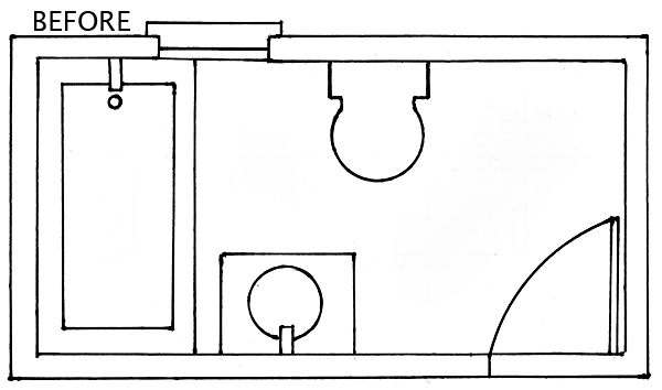
BEFORE: The square footage in our bathroom is very generous as far as New York apartments go. However, the space felt cramped and unbalanced, as though everything had been shoved to the left side of the room. Look at all that unused dead space on the right! The window was also awkwardly positioned and straddled the Jacuzzi/shower. This really, really bugged me, and I've spent many sleepless nights trying to come up with a viable solution for this aesthetic dilemma. I know, you don't want my problems. (Before photos here)
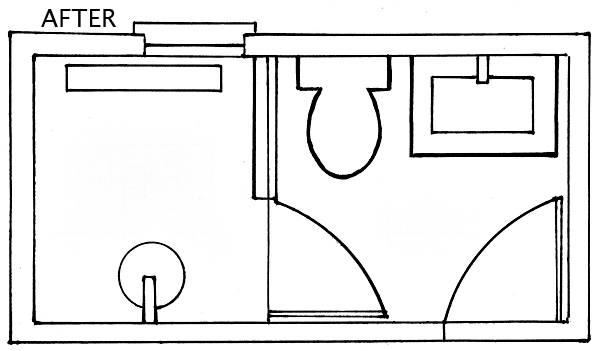
AFTER: I designed the layout to spread across the entire space. In my new floor plan, the sink is relocated over and across to the other side of the room, and the Jacuzzi is GONE! Opening up this area allowed me to add a large walk-in shower in lieu of a tub. I don't know about you, but I prefer steamy, hot showers over pruning up in a tub of soapy suds. Notice how the window now lives happily inside the shower walls! Hooray! Not only does this reconfigured layout provide a smoother flow of balance, but the entire space just feels a lot more functional and spacious.
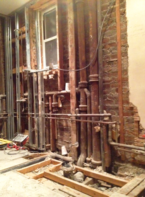
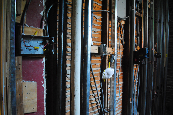
We opened up the floor to re-route the sink plumbing across the room.
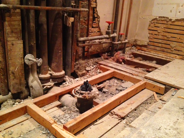
The toilet did not move, but the original round-bowl model was removed to be replaced with one with an elongated bowl. Elongated bowls are a little bit more guy-friendly, if you get my drift!
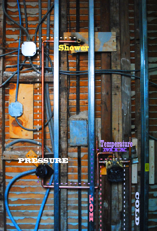
The shower pipes were also re-routed across the room so that the fixtures could sit perfectly centered in the stall. This was done purely for aesthetic reasons, but trust me, it makes total sense in the big picture. We installed thermostatic and volume control valves, which I am incredibly excited about. So gangsta.

As you can see, moving plumbing fixtures is no easy feat. I initially booed and hissed my way through all the DOB paperwork and fees, writing it all off as one big expensive, time-consuming nuisance. However, after seeing all the technical aspects involved in this project, I am so thankful we took the necessary steps to do everything the legit and legal way.

Anyway, now that all the nitty gritty details are done and over with, we can start making things pretty :) More later!

Wednesday
May152013

Mortar Kombat

Guess what, guys! I am FINALLY done with my brick wall project. Yippee! Hooray! Whew.

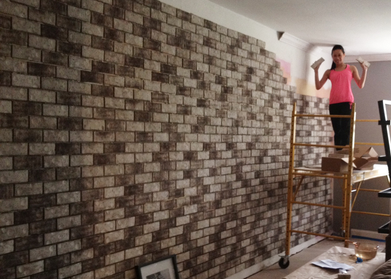
Once the mortar was mixed and the bricks had been laid out, I experienced a major "Oh-crap-what-have-I-gotten-myself-into" moment. I honestly felt that I'd bitten off more than I could chew. But everything was all set and ready to go, and those naked, patched-up walls were seriously starting to make my eyes bleed. So there was no turning back. It was time to get down and dirty.

It's been a grueling, dusty, and extremely rewarding month. Here's the recap of my first foray into masonry:


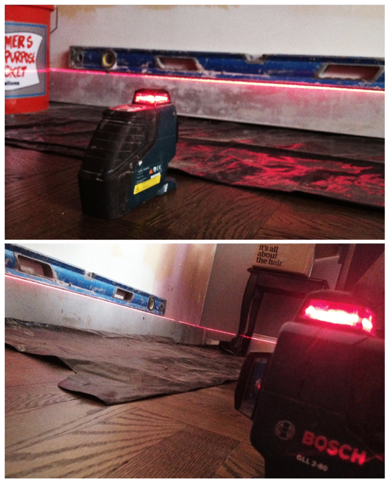
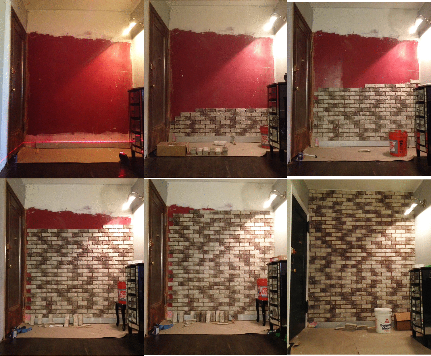
Recognize this awesome laser? A perfectly level foundation is the key to a straight wall, so I used this handy tool to guarantee that my bolsters were 100% straight prior to laying the first brick.

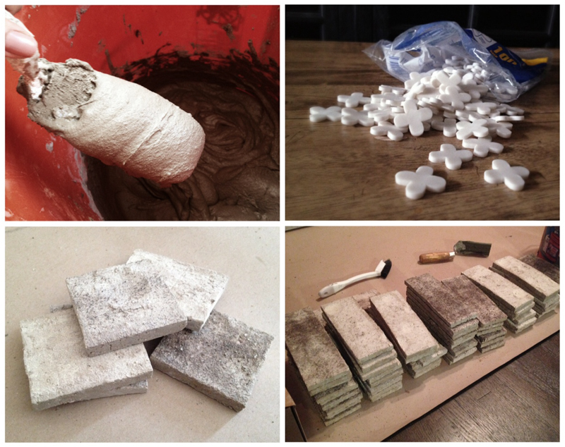
Next, I combined powdered thinset mortar with water and mixed it into a thick, batter-like consistency. The boxes of veneers came in mixed assortments of grays and browns, so I organized all the bricks by color in order to plan out an even distribution of all the variations.


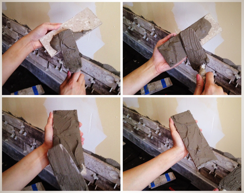
This technique is called back-buttering, and it really is like spreading peanut butter onto a piece of toast! I found that an even 2/3" layer was enough to grip the wall without oozing everywhere.

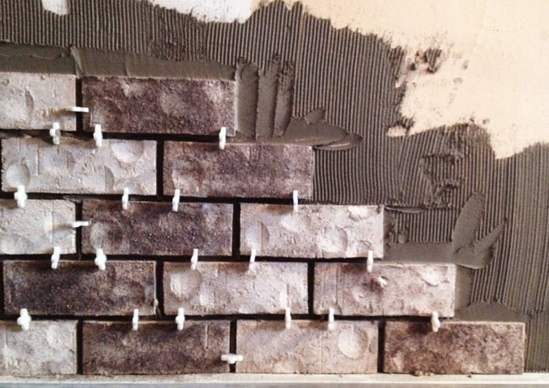
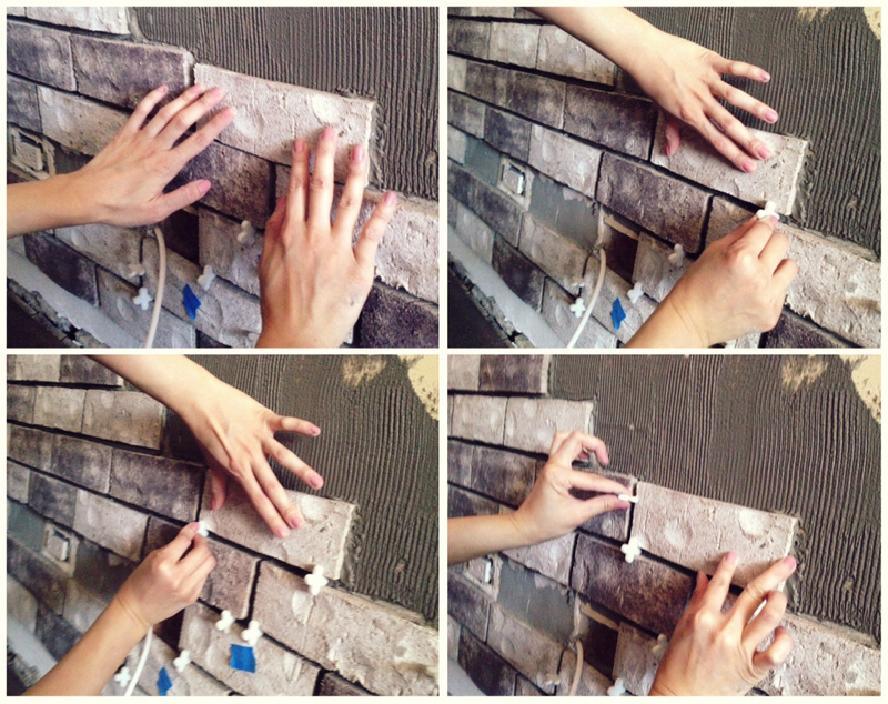
After back-buttering, I pushed and wiggled each tile against the wall until the mortar started pulling at the brick. Once the suction was created, I slowly slid the brick up and over, using spacers to maintain even distancing between each brick. I went with 3/8" spacers, which is the standard joint spacing for real brick walls.


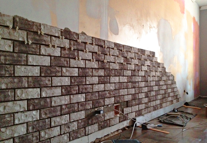
------------ Repeat for 280 square feet. ------------

It took me about two days to get a hang of the fundamental techniques and stop making huge messes everywhere. After that, I started throwing bricks on the wall like nobody's business. This project didn't call for any extraordinary skills, but it did require an insane amount of tedious repetition and grunt work. I can't even complain, because all that squatting, lifting, bending, and reaching totally whipped me into shape ;-)

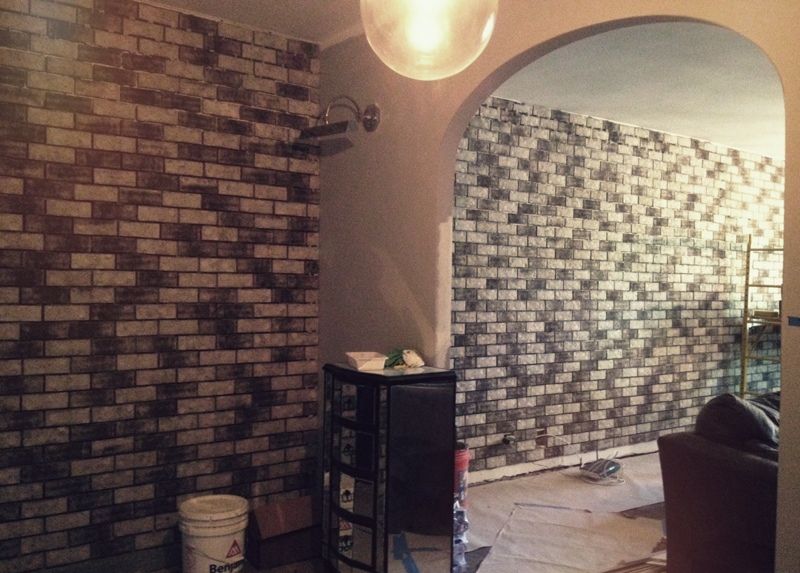
I also tackled a smaller wall by our entryway in order to establish a smooth, transitional flow into the living room. The previous owners were obviously really into the color red. I think it made them happy. Kinda like how Wonka makes me happy.

Mid-point laser check! Yup, still straight :)

Almost there!! Chris and I signed the back of the final brick before it was set into place, and...

Bam! All done.

This project was a true labor of love. Sure, I've been sporting a set of calloused man hands for about a month, and I also dropped/broke a brick on my foot, rendering myself incapable of wearing any cute shoes for the next few weeks. But the wall is finally complete, and I am deliriously happy with the outcome.

Once the crown and base mouldings are installed, our living room renovation will be finished! We are sooo close, and I absolutely cannot wait to share the final transformation with you. Stay tuned!

Monday
May062013

What's Cookin', Good Lookin'?

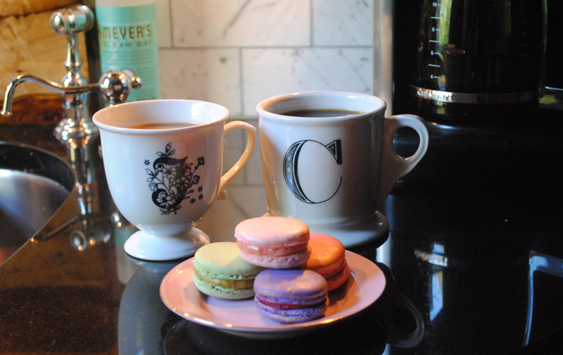
One of my favorite memories of Florence was the time Chris and I spent sitting outside a tiny bistro café, chatting, people watching, and sipping cappuccinos. It was so relaxing and romantic!

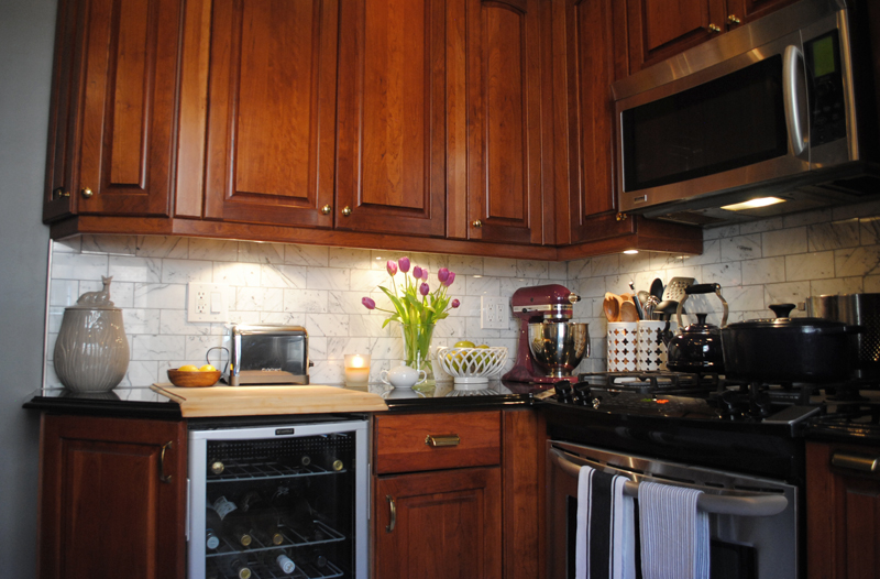
Since our existing kitchen already had an Old-World-European motif going on, I decided to take it and run with it. My goal was to adapt the same look and feel of that café into the workings of a functional kitchen. Here are the traditional and modern elements I married up to create a timeless space that we can enjoy for years to come:

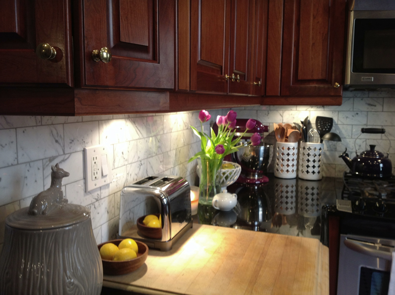
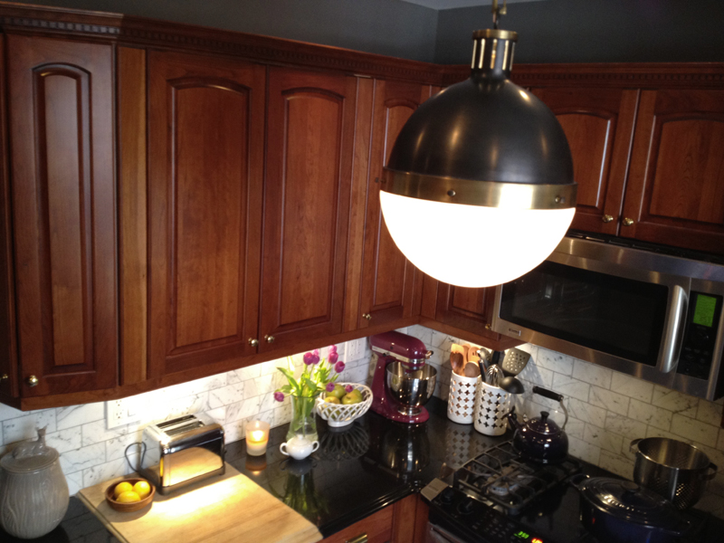
Brass Hardware - Rather than changing the color of our cabinets, I sprung for some new hardware instead. Swapping in new knobs, handles, and pulls is an easy and affordable way to update cabinetry. Hardware is like jewelry for furniture, and you'd be surprised what a difference a tiny change can make! I opted for brass hardware, which develops a lovely patina over time and will beautifully compliment the cherry wood as it ages.

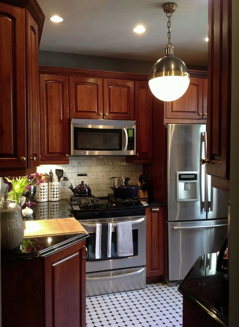
Pendant Lighting - Pendant lighting provides an industrial quality that is often present in classic bistros. My handsome Hicks pendant delivers a solid punch of masculinity in an otherwise elegant space.

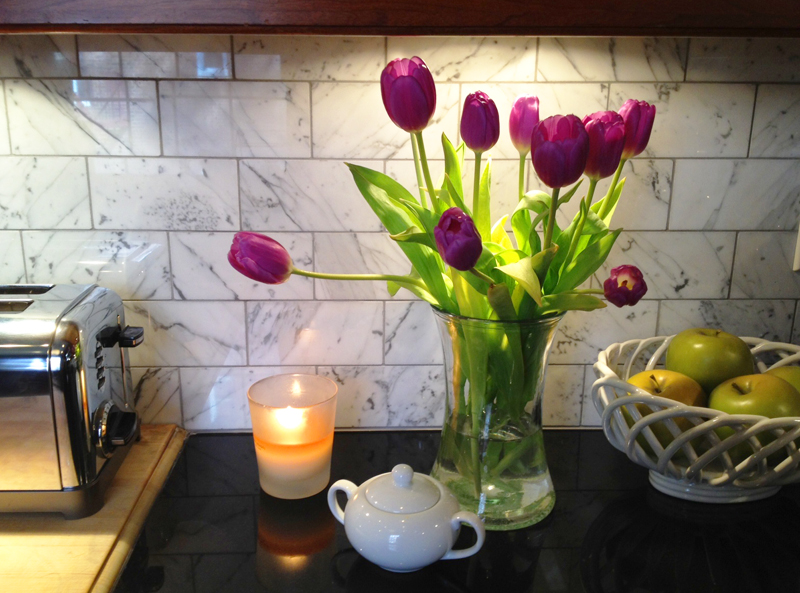
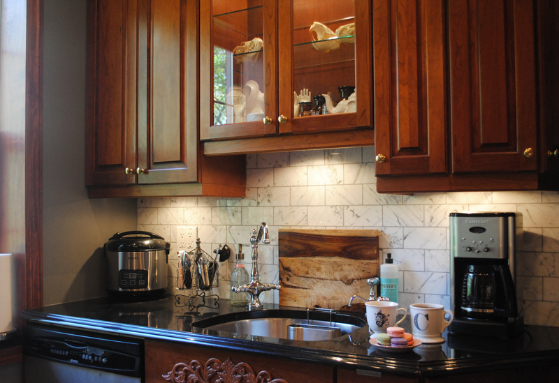
Marble Backsplash - I've got a slightly unhealthy obsession with marble and have been searching for a practical way to incorporate it into our home. Marble is a highly porous stone and it stains easily, which makes it a high-maintenance choice for countertops. It also comes with a fancypants price tag, which made it no-go for tiling the bathroom. Our backsplash, on the other hand, only required a minimal amount of square footage. It was the perfect opportunity to pounce!

I went with a polished Carrara Bianco, which has a greyer base and more veining than Carrara Venato, which is a whiter stone with less veining. The cool marble gracefully harmonizes with the warmth of our cabinets and lends a rich gourmet feel to the room. Totally worth the splurge!

Gray walls - Benjamin Moore's Chelsea Gray is a deep, sophisticated gray with a hint of brown. Combined with a fresh coat of white paint on the ceiling, this new color sets the tone of a very fresh and cozy atmosphere.

I also have a bucket of chalkboard paint that I'll be using to create a chalkboard wall later on. I dare you to find a bistro without a chalkboard! Not only are they extremely useful, they are just so much fun.

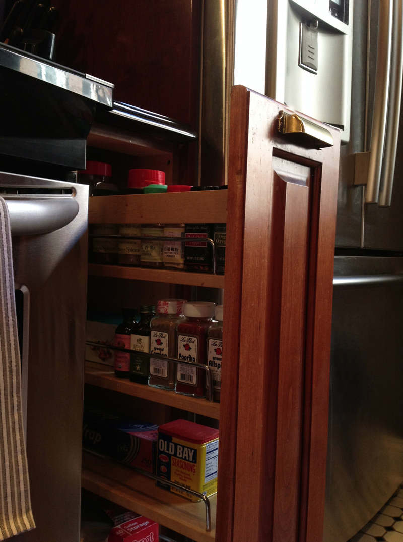
Get a load of this spice drawer! This drawer was part of the original kitchen design, and I get a little giddy every time I pull it open.

Wine fridge. 'Nuff said.

The sink and faucet are staying put for now, until I find an ideal replacement. (I'm thinking farmhouse!) Still working on styling those glass cabinets...

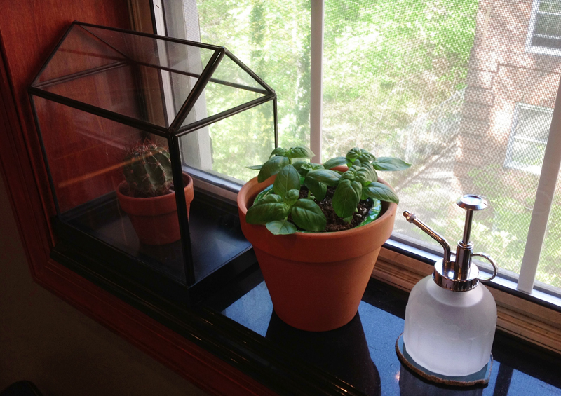
This sunny spot on our window sill would make a great home for some kitchen herbs! Even though my two current victims include a lonely cactus and a basil plant, I hope to gradually expand. Maybe some cilantro for guacamole... or perhaps mint for mojitos?? :)

Black & White Floors - I did not touch our floors because they were already the shizz. Black and white octagon tiles are the quintessential example of pre-war aesthetic, and I love how their vintage New York vibe balances out the modern sheen of our stainless steel appliances.

And there you have it! A simple, yet powerful transformation. ("Befores" here) This room feels much more personal now, and it actually inspires me to step up my culinary game. And you know what? I am really, really glad I gave those cabinets a chance :) More later!