Entries in 2013 (23)

Tuesday
Aug132013

If These Walls Could Chalk

Well, it certainly has been an eventful summer! Chris and I have been enjoying back-to-back soirées - birthdays, baby showers, bachelor/bachelorette trips, weddings, reunions - it has been nonstop. There is so much to celebrate! Life is good :)

I’m always happy to find a little downtime in between the all the confetti and champagne to work on projects I’ve been itching to tackle. I recently took advantage of a quiet Sunday afternoon to add a chalkboard wall in our kitchen! This was a relatively easy project that transformed the entire wall into a fun and useful surface.
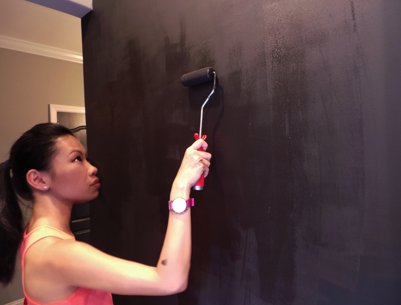
When we first moved in, Chris and I were surprised to discover that our fridge is not magnetic. This project was the perfect opportunity to add that additional handy functionality to this wall.

I used three coats of Rust-Oleum's Magnetic Primer, which dries to a deep grey finish. *Tip* When using this stuff, make sure you stir thoroughly before pouring the paint, and keep stirring throughout the painting process. The heavy magnetic "goo" tends to sink, so you need to make sure it stays suspended in order to achieve an even application. I used a foam roller to get a super smooth finish. The smoother the finish, the stronger the magnetic attraction will be. Allow 30 minutes between each coat.

I was pretty shocked when I opened the chalkboard paint. It looked blue! I triple-checked the label to make sure I had purchased a "black" formula, and even upon confirmation, I felt uneasy. It just looked very blue...

I got even more nervous when the paint went on the wall. It was definitely blue. I threw down the roller and rushed to Google "Rust-Oleum Chalkboard Paint + blue". Not a single person on the internet mentioned their black chalkboard paint looking blue! But then I saw that the paint only came in "green" or "black" - blue wasn't even an option. I decided to take a deep breath and keep going. I applied two layers of paint, allowing 4 hours between each coat.
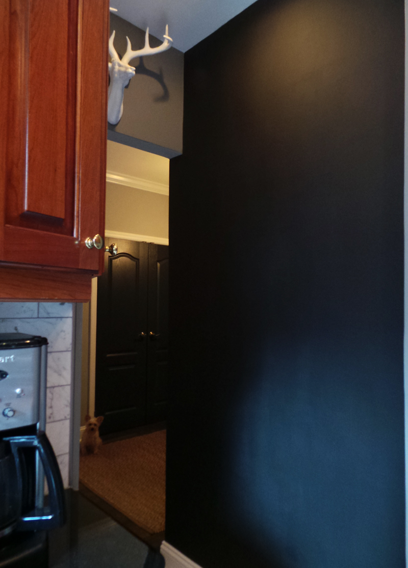
Thankfully, the paint dried to a satin black finish. Whew!! :)
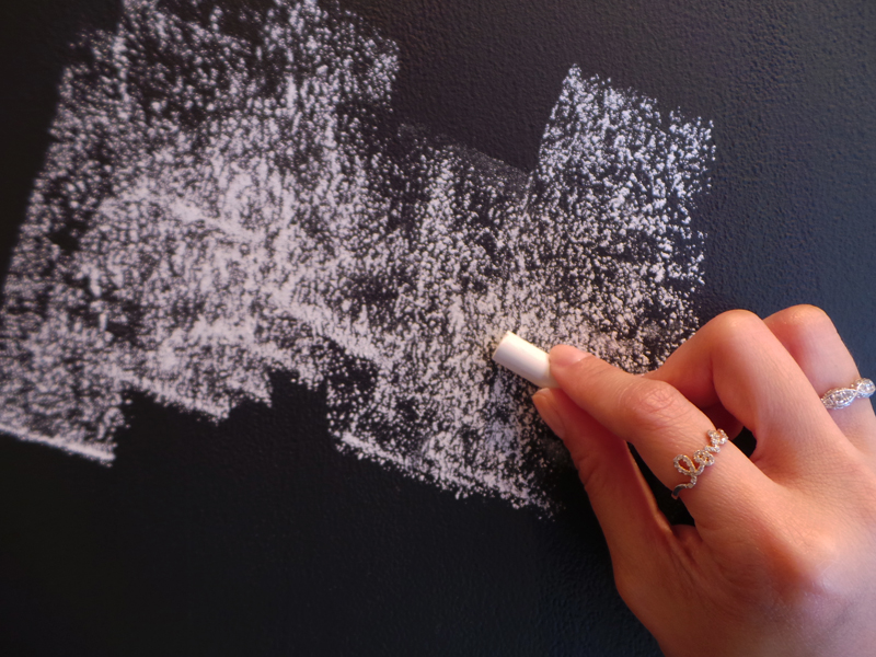
After allowing the paint to cure for three days, it was time to season the wall. It's important to season a chalkboard before writing anything on it because the surface is very porous. Seasoning easily prevents ghosting, which is when chalk lines are "burned" into the board and never fully erase.

Seasoning is easy - just turn a piece of chalk on its side and shade in the entire surface. Rub the chalk top to bottom, left to right in order to get into all of the pores. 
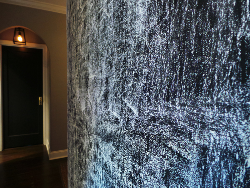
Once the entire surface is covered, simply erase, and you're all done!
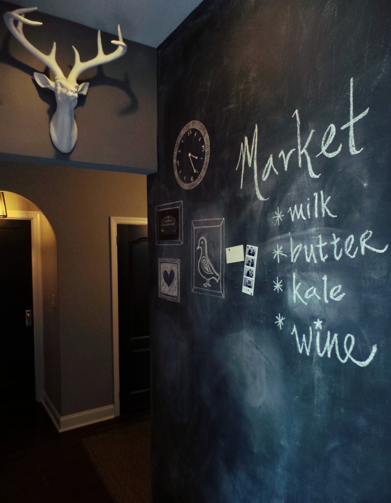
Now the fun can start! I was never good at writing neatly on the board in school, so it's definitely going to take a while before I get a hang of it and start creating any real chalkboard art.
But that's the beauty of chalkboards - If you mess up, just erase and start over! Practice makes perfect :)
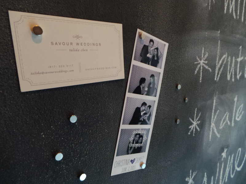
The magnet wall lets us share sweet mementos and reminders of upcoming events!

I thought it would be fun to start a gallery wall as a neat way to display all our random notes and doodles.

Wonka has his own little gallery! His first two installments? Portraits of his Mini-Poodle mama and Yorkie daddy :0)

Tuesday
Jul092013

Bath Time

I firmly believe that a bathroom should be incorporated into the rest of the home. We spend a great deal of time in this space, and it does not need to feel completely stark and sterile, if that isn't your thing. Just like any other room, your bathroom should reflect your personal style, and most importantly, it should make you feel happy!

Since our bathroom is a shared space, I focused on maintaining a balance between feminine and masculine elements in its design. Also, because this is the only bathroom in our apartment, I wanted to create a room that feels welcoming to our guests. On that note - Welcome to our bathroom!

Lighting is a vital element in creating ambience in any room. Our bathroom came with recessed lighting, but I couldn't resist adding a set of sconces and an overhead flush-mount. Each source is hooked up to separate dimmers, allowing lots of flexibility to set the tone for any mood and cast a flattering light from every angle.

A pedestal sink is an excellent space-saver and injects a dose of classic elegance. Although our sink offers a generous expanse of counter space, we did end up losing out on under-sink storage. This challenged me to explore additional storage options, and I'm glad to say I found several fantastic solutions.

Surprise! This may look like an antique mirror from the outside, but it's actually a fully functional medicine cabinet. It offers plenty of storage for all our grooming goodies and keeps everything concealed, yet readily accessible.

Isn't this overhead fixture so fun? It turns one pretty light bulb into seven pretty light bulbs :)

Okay, I know this sounds crazy, but can I just tell you how psyched I am to finally have a normal white toilet with a tank?? Like most pre-war buildings, our old apartment had a tankless flushometer toilet. It was basically a chrome pipe sticking out of a peachy-pink bowl. Although I must admit that thing was quite the power-flusher, it was a total eyesore, and I couldn't get past feeling like I was in a public restroom every time I used it.

At the risk of sounding even crazier, I'm going to go ahead and call this toilet "handsome" - Its bold lines balance out the feminine daintiness of the pedestal sink and add structure to the room.

The glass cabinet provides allows us to store and display our prettier toiletries. I've been having so much fun styling it and making it look nice! :)

Another perk of having a tank toilet? An additional surface area for storage and knickknacks.

Wainscoting is an excellent way to add streamlined interest to your walls without tiling the entire bathroom. The rustic feel of the beadboard pairs so well with the earthy look of the slate tiles. Together, they bring warmth into in a room filled with glossy porcelain, shiny tiles, and chrome and nickel fixtures. The vertical panels end just below eye level, lending an illusion of height to the space.

Chris picked Benjamin Moore's "Wrought Iron" for the walls, and I must say he made an excellent choice! The rich color echoes the slate flooring perfectly and brings a unified look to the room. Contrary to popular belief, dark walls can actually make smaller spaces feel larger! The deep hue creates a crisp, clean contrast against the bright white details. With all the whites popping forward, the walls are visually pushed back, making the room feel bigger.

I absolutely love having a window inside our shower. The custom glass enclosure allows natural light to pass through to the rest of the room, keeping everything airy and bright.

Here's the thermostatic shower I was telling you guys about! It automatically adjusts to your designated temperature preference and delivers a delicious array of spray settings. Apartment dwellers - If you're sick of getting zinged every time somebody in the building flushes a toilet, a thermostatic shower is a total game changer.

I've never met a single person who didn't like subway tiles. These beveled beauties exude the classic look of traditional subway, with a touch of unexpected flair. Oh, and that bench is SUCH a heavenly treat at the end of a long day!

His/Hers cubbies built into the pony wall offer plenty of storage and keep our personal toiletries out of sight. These hidden cubbies really keep the bathroom comfortable and inviting for visitors, because nobody (including you) needs to see our squeegee, razors, and loofahs. BTW - Did you know that they brought back the original Herbal Essences Smooth & Shine Collections?! Total 90's nostalgia, without all the sulfates! :)

And that's our new bathroom! (Befores here) We officially wrapped up rennovations two weeks ago. It's been a heckuva journey, and I could not be happier with the way our home has turned out. But wait! This doesn't mean the fun has to end - now the decorating can start! Lots more to come, stay tuned :)

Thursday
Jun202013

Clean Slate


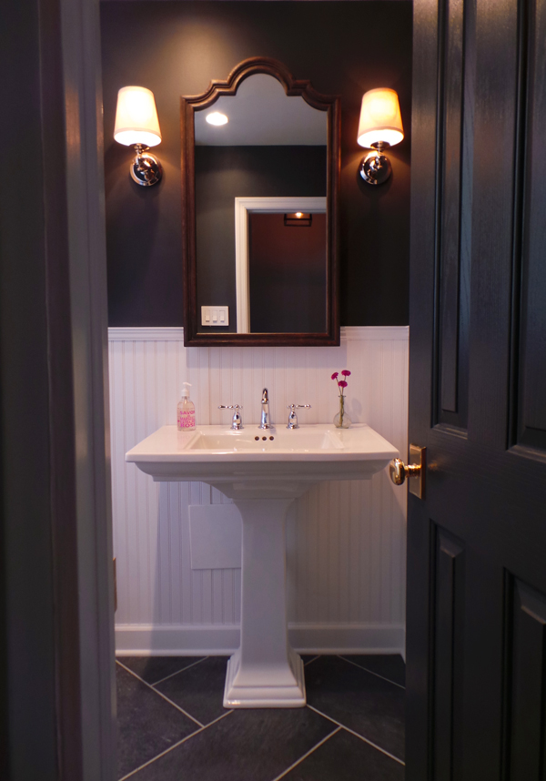
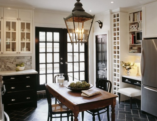
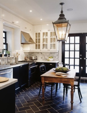
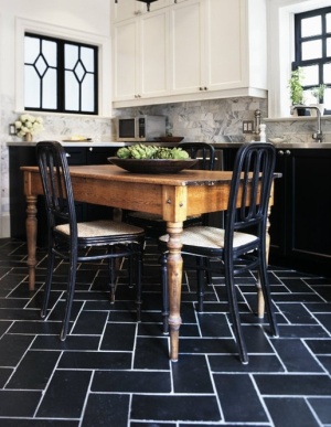
I have been smitten with Tommy Smythe's kitchen ever since the moment I first laid eyes on it. Carrara backsplash, dual-tone Shaker cabs, French doors, antique paned windows, and don't even get me started on that oversized lantern. And THOSE FLOORS. I instantly fell for them and knew right then and there that we just had to have herringbone slate floors in our new home. Well, guess what! Our bathroom demo was my golden opportunity to make it happen :)

Although slate is extremely durable and low-maintenance, it is still a porous stone and not the best choice for a walk-in shower. Since I wanted to keep the flooring consistent throughout the entire room, I opted for the next best thing - Porcelain tiles from Italy that really look and feel like the real deal!

Herringbone is a busy pattern that takes up a lot of visual space. Working with larger dimensions keeps the pattern bold but subtle, and actually makes a room appear bigger! These 12x24" tiles provide tons of surface area that will be easy to maintain and keep clean.

We installed a pony wall to separate the shower area from the rest of the room.

Once the entire room had been triple-waterproofed, the shower's interior was pitched at an angle towards the drain.

Tiles were then installed in a subway pattern in order to allow water to flow smoothly toward the infinity drain.

The gorgeous herringbone pattern will run throught the rest of the room. There goes that laser again!


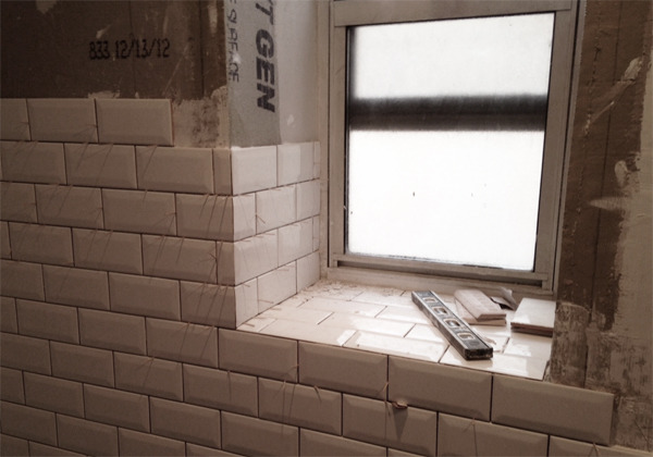
I chose beveled subway tiles for the walls. The way their smooth facets sparkle against the rugged texture of the floors makes my heart sing ooh-la-la.

Almost there! I cannot wait to share the finished room with you. Stay tuned :)